
Banners
Design a banner
Background, colours, spacing, the close button, and making the whole bar a link.
The Design panel is the brush icon in the builder’s rail. It covers everything about how the bar looks, apart from the elements themselves.
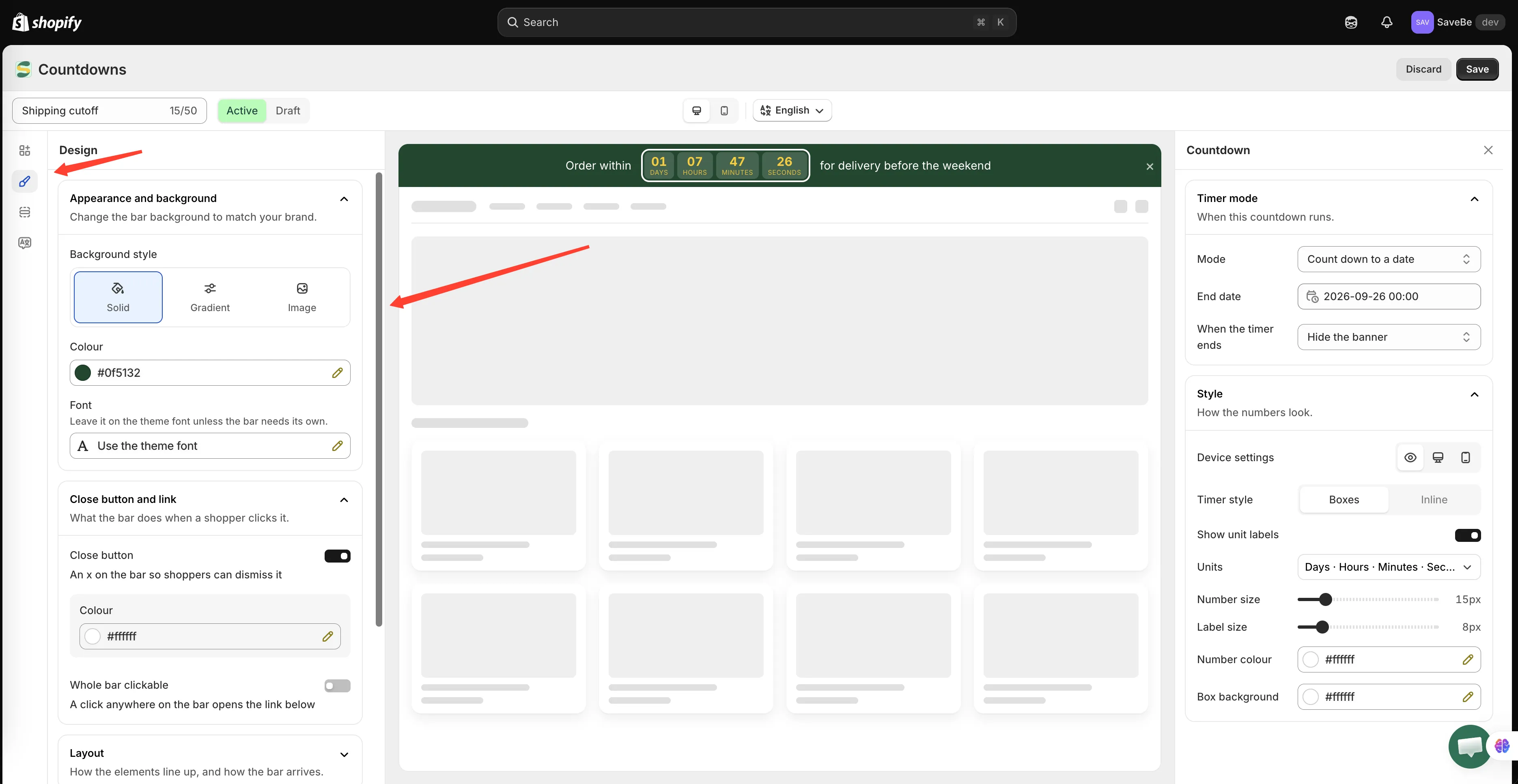
Design settings apply to the whole bar, not to one element.
Appearance and background
Section titled “Appearance and background”Three background styles:
| Style | What you set |
|---|---|
| Solid | One colour |
| Gradient | A from colour, a to colour, and an angle |
| Image | A picture that covers the bar |
Colours
Section titled “Colours”| Setting | What it covers |
|---|---|
| Font | The typeface. Leave it on the theme font unless the bar needs its own. |
| Text | The bar’s text colour |
| Accent | Buttons, discount codes, and the countdown — unless one is given its own |
Accent is the one worth understanding. Set it once and the button, the code outline, and the timer all follow. Give an element its own colour and that element stops following.
Close button and link
Section titled “Close button and link”Two separate things, both about what happens when a shopper interacts with the bar.
Close button
Section titled “Close button”Turn it on and an × appears at the end of the bar. Set its colour and its hover colour.
Once a shopper closes the banner it stays closed for them — the app remembers in their browser, so it doesn’t reappear on the next page.
Whole bar clickable
Section titled “Whole bar clickable”Turn this on and a click anywhere on the bar opens the link you set below it. Open in a new tab leaves your shop open behind it.
Clicks on a button or a discount code inside the bar still do their own thing — the bar link doesn’t swallow them.
How the elements line up inside the bar.
| Setting | What it does |
|---|---|
| Alignment | Left, centred, right, or spread out |
| Gap between elements | The space between each element |
| Wrap on small screens | On, the row wraps onto another line when it runs out of room. Off, it squeezes instead, which can clip long messages. |
Spacing
Section titled “Spacing”Vertical padding is how tall the bar is. Horizontal padding is the margin at each end.
A thin bar reads as a notice; a tall one reads as a section of the page. Most announcement bars want the thin end.
Custom CSS
Section titled “Custom CSS”At the foot of the panel, Custom CSS (Developer Zone) takes rules that apply inside this banner only. They can’t reach the rest of your theme.
Use it for the things the panels don’t cover — a text shadow, a letter spacing, a different border on one element.