
Design and position
Style a sale popup and decide where it floats on desktop and mobile.
The Design tab controls how a sale popup looks and where it appears. It’s split into background, position, size, and fonts, with a custom CSS box at the end.
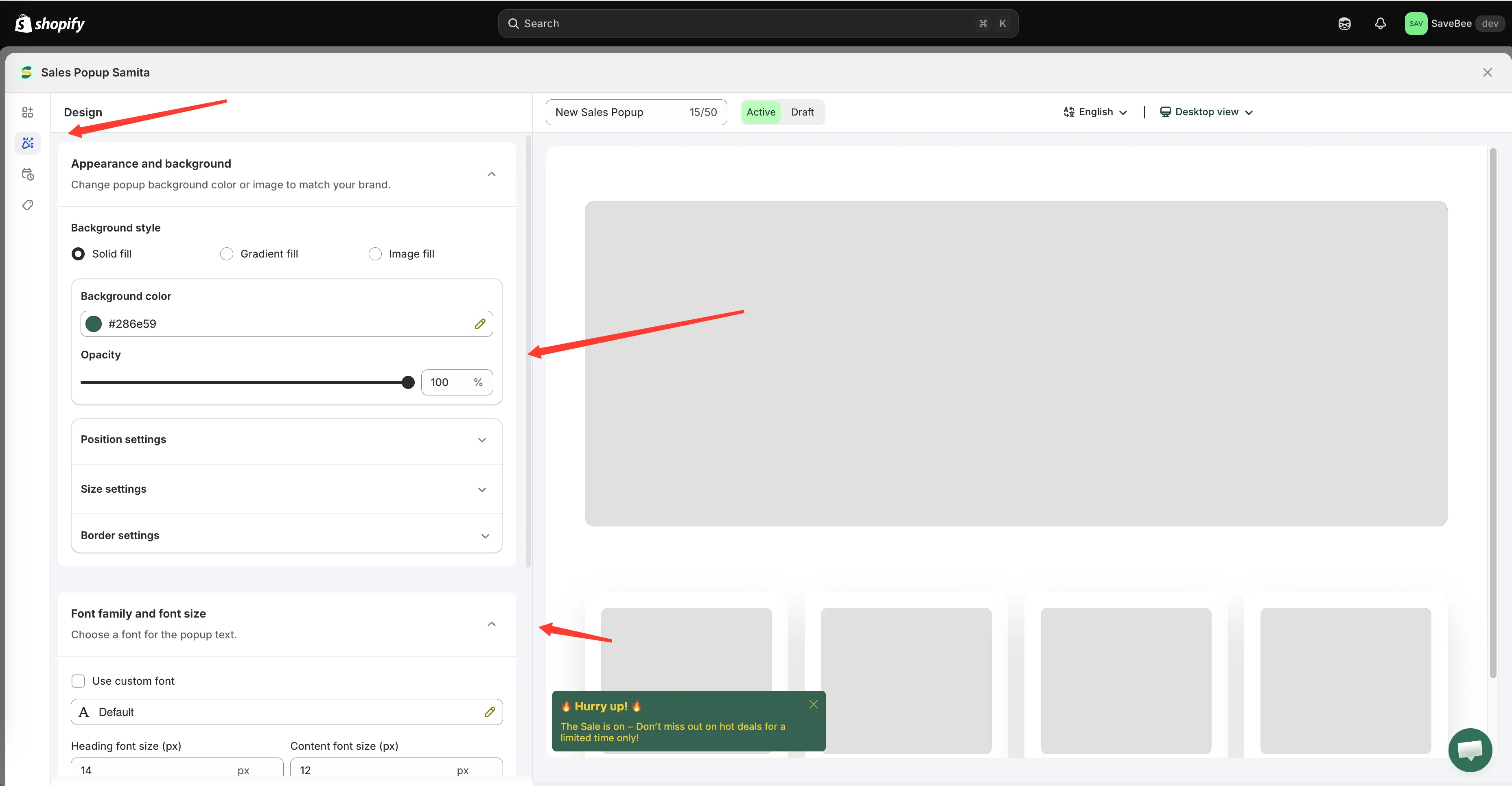
The Design tab, with the popup preview beside it.
Appearance and background
Section titled “Appearance and background”Background style offers three fills:
| Style | What you set |
|---|---|
| Solid fill | A Background color and an Opacity |
| Gradient fill | Gradient color 1, Gradient color 2, and an Opacity |
| Image fill | An uploaded image — PNG, JPEG or JPG, under 1 MB |
Alongside it you’ll find Border settings — Border style (Solid, Dashed, Dotted), border size, radius, colour, and a Box shadow toggle — plus Padding and Margin.
Position settings
Section titled “Position settings”Where the popup floats. Desktop and mobile are configured separately, on their own tabs.
Desktop
Section titled “Desktop”- Show on desktop — turn desktop display on or off
- Desktop position — Top left, Top middle, Top right, Bottom left, Bottom middle, or Bottom right
- Animation type — Slide from top, Slide from bottom, Slide from left, Slide from right, or Fade in-out
- Margin top/bottom (px) and Margin left/right (px) — nudge it away from the screen edges
Mobile
Section titled “Mobile”The same set: Show on mobile, Mobile position, animation, and margins.
Choosing a position
Section titled “Choosing a position”Bottom left is the default and the safest. It’s out of the way of your header, your cart, and the sticky Add to cart bar most themes put at the bottom of a mobile product page.
Worth checking before you settle on anything else:
- Bottom right collides with live-chat widgets on many stores.
- Top positions can cover announcement bars and sticky headers.
- Mobile margins matter more than desktop ones — there’s far less room for the popup to sit in.
Size settings
Section titled “Size settings”| Setting | Options |
|---|---|
| Popup size | Small · Medium · Large |
| Image size | Small · Medium · Large |
| Use different size for mobile | Unlocks Mobile popup size and Mobile image size |
Turn the mobile option on for anything above Small. A Large popup on a phone can cover most of the screen, which is the fastest way to have it closed unread.
Font family and font size
Section titled “Font family and font size”- Use custom font — pick a font family and weight, or inherit your theme’s
- Heading font size (px) and Content font size (px)
Matching your theme’s font is usually what makes a popup feel like part of the store rather than something bolted on.
Custom CSS
Section titled “Custom CSS”A Custom CSS (Developer Zone) box at the end of the tab takes plain CSS applied to this popup. The same cautions as elsewhere apply — see Custom CSS.
Placing a popup in the page instead
Section titled “Placing a popup in the page instead”By default a popup floats above the page at the position you set here. If you’d rather have it sit inside the page — in a section, at a fixed spot — the Display tab has a shortcode for that, under Custom location to show popup:
<div class="samita-sales-popup" data-id="12345"></div>Copy it, then paste it into a Samita Countdown app block in your theme editor. The steps are the same as for countdowns — see Place a countdown with a shortcode.