
Build your form
Add fields, rows and pages to an application form, and set up each field in the builder.
The builder is where you decide what an application form asks. You add fields, group them into rows, split the form into pages and set up each field. The preview in the middle shows the form the way buyers see it on your store.
The builder at a glance
Section titled “The builder at a glance”| Area | Where | What it’s for |
|---|---|---|
| Section rail | Far left | Switches between Elements, Appearance, After submit, Email and Integrations. Collapse folds it down to icons. |
| Elements panel | Left | The form’s outline: Header at the top, Content, each page with its fields and rows, Add page, and Footer at the bottom. |
| Preview | Middle | The form as buyers see it. Click a field, a page heading, the header or the buttons to select it. |
| Settings panel | Right | Opens when you select something and shows its settings. Click × (Close) to close it. |
| Toolbar | Above the preview | The Form name box, the Active or Draft badge, … (More actions), Language, the desktop and mobile preview buttons, the inspector button and Preview. |
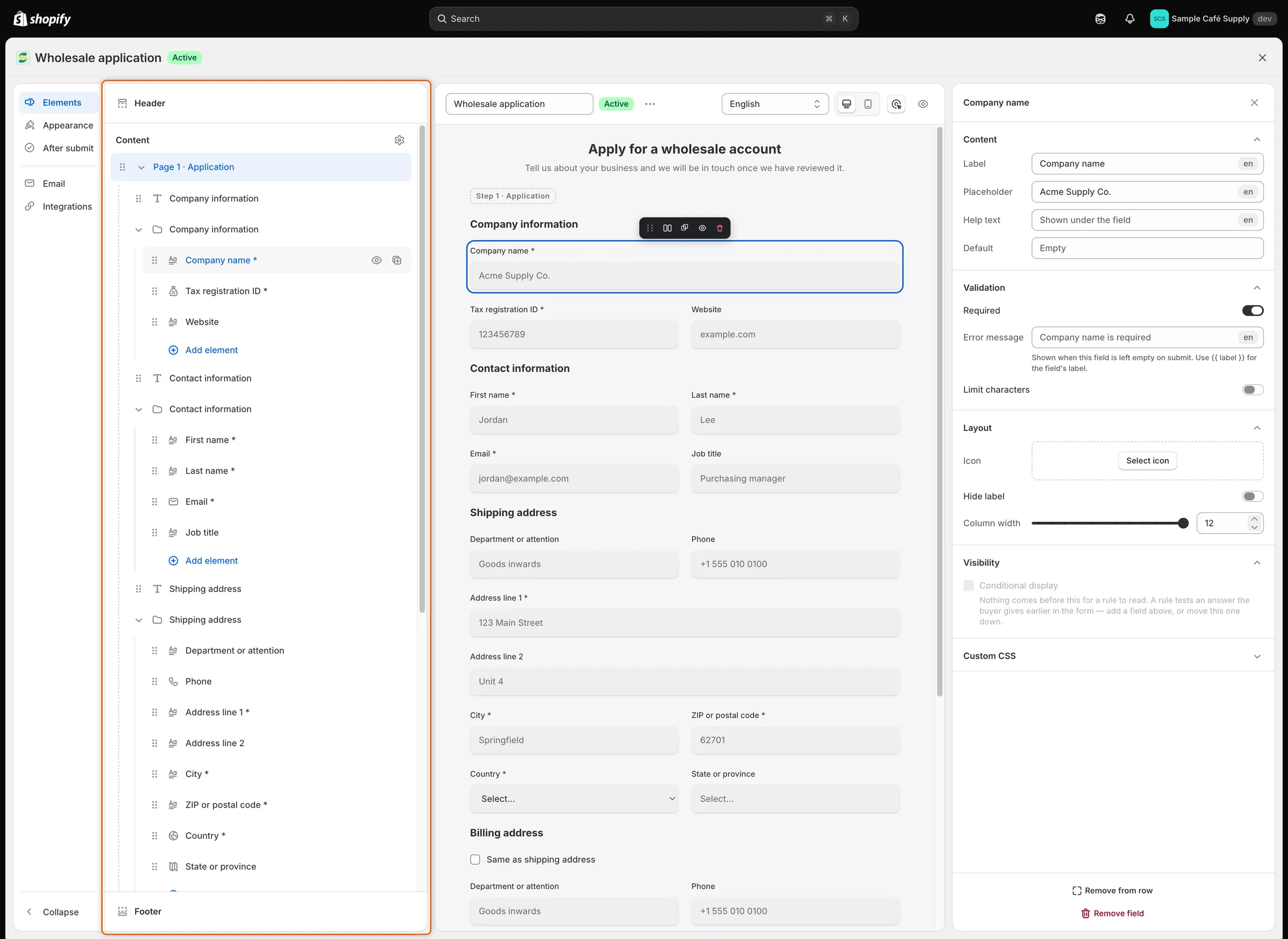
The Elements panel lists every page, row and field in the order buyers meet them.
The other sections of the rail have their own pages:
| Section | What you set there | Read more |
|---|---|---|
| Appearance | Layout, width, font, field style and colors. | Design the form |
| After submit | The thank-you message, or a page to send buyers to. | After the buyer submits |
| Who hears about this form, and this form’s own version of each email. | Edit email templates and Choose who gets notified | |
| Integrations | Where answers go in Shopify, plus Klaviyo, webhooks, address autocomplete and captcha. | Map answers to Shopify |
Add a field
Section titled “Add a field”-
Open the field list
Section titled “Open the field list”Use whichever is closest:
- In the Elements panel, click + (Add field) beside the page’s name, or Add field at the end of the page. Inside a row, click Add element to add the field to that row.
- In the preview, click Add a field at the end of the page.
- In the preview, point at the edge of a field and click the + that appears. Its tooltip says Add field above, Add field below, Add field to the left or Add field to the right. Left and right put the new field beside this one in a row.
-
Find the field
Section titled “Find the field”Scroll the list, or type in Search fields to narrow it.
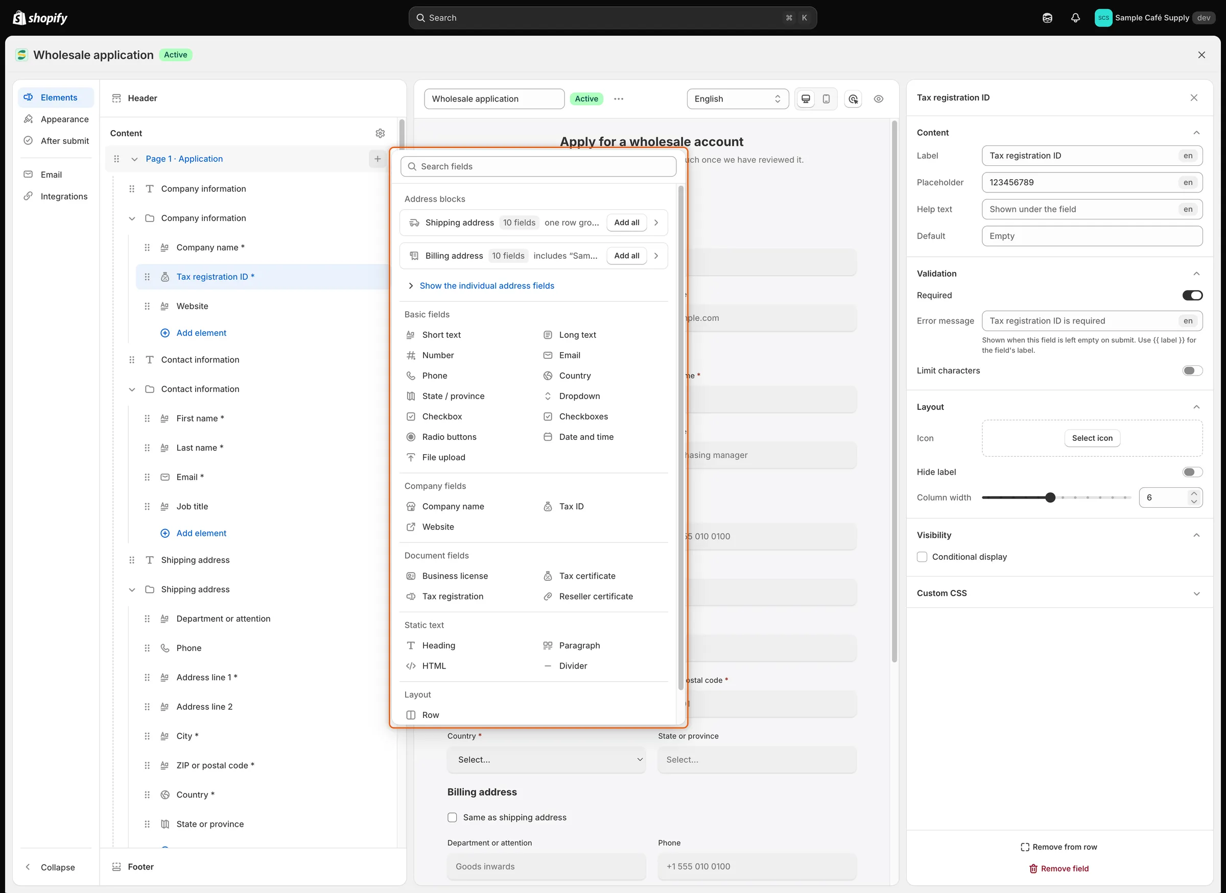
Fields are grouped by kind, and Add all on an address block adds a whole address in one click.
-
Add it
Section titled “Add it”Click the field. It is added to the page and selected, and its settings open on the right. Give it a label and set it up (see Field settings).
Fields you can add
Section titled “Fields you can add”| Group | Field | What the buyer gets |
|---|---|---|
| Basic fields | Short text | A one-line text box. |
| Long text | A text box for several lines. | |
| Number | A box that takes numbers only. | |
| A box that checks the answer looks like an email address. | ||
| Phone | A phone number box, with an optional country flag, dial code and number check. | |
| Country | A list of countries. | |
| State / province | A list of the states or provinces of the country picked in the Country field before it on the page. It shows once the buyer picks a country that has states, and is a plain text box when no Country field comes before it. | |
| Dropdown | A list to pick one choice, or several with Allow multiple choices. | |
| Checkbox | A single tick box, such as “I agree to the terms”. When it is required, the buyer must tick it. | |
| Checkboxes | A list of choices the buyer can tick any number of. | |
| Radio buttons | A list to pick one choice, with an optional Other choice the buyer types in. | |
| Date and time | A date picker, a time, or both. | |
| File upload | An upload box. By default it takes PDF, JPG, JPEG and PNG files up to 10 MB. | |
| Company fields | Company name | A text box saved as the company’s name. |
| Tax ID | A text box for the company’s tax or VAT number. The app’s tax ID checks read this field. | |
| Website | A text box for the company’s website. | |
| Document fields | Business license, Tax certificate, Tax registration, Reseller certificate | An upload box. The file is kept with the application as that type of document. See Documents. |
| Static text | Heading | A title with an optional caption under it. |
| Paragraph | Formatted text, such as instructions. | |
| HTML | Your own HTML markup. | |
| Divider | A horizontal line. | |
| Address blocks | Shipping address | Ten fields in one row: Recipient / department, First name, Last name, Phone, Address line 1, Address line 2, City, Country, State / province and ZIP / postal code. Click Add all. |
| Billing address | A Same as shipping address tick box, then ten billing fields (Department / attention, Billing first name and so on) in a row that is hidden while the box is ticked. Click Add all. | |
| Layout | Row | An empty row to put fields in. See Group fields into rows. |
To add a single address field instead of a whole block, click Show the individual address fields under Address blocks. The fields an address block adds aren’t saved to Shopify until you map them. See Map answers to Shopify.
Field settings
Section titled “Field settings”Click a field in the preview or in the Elements panel. Its settings open on the right in sections. You only see the sections that apply to that kind of field.
| Section | Settings |
|---|---|
| Content | Label, the question the buyer reads. Placeholder, the faint text inside an empty box. Help text, shown under the field. Default, an answer filled in when the form opens (for a single Checkbox: Ticked by default). |
| Options | For Dropdown, Checkboxes and Radio buttons. Click Add option or Change to edit the choices: type each choice’s Label, drag to reorder, Add another option, or Bulk add one choice per line. Customer tags are added to the Shopify customer when a buyer who picked that choice is approved (up to 40 characters each). Turn off Use the label as the value to store something other than what the buyer reads. A Dropdown also has Allow multiple choices. Radio buttons also have Other option, Other label and Other placeholder. |
| Upload | For File upload and document fields. Accepted: Only certain file types (then list them in File types) or Any file type. Max size: 1 to 20 MB. Allow more than one file. |
| Phone number | Show country flag and dial code. With it on: Check the number is valid and Default country (From the buyer’s browser unless you pick one). |
| Date and time | Asks for: Date, Time or Date and time. Date format, Time format, Other language for the date picker, and Limit the range with Earliest and Latest. |
| Validation | Required. With it on, Error message, shown when the field is left empty; type {{ label }} to include the field’s label. Limit characters with Min characters and Max characters, for Short text, Long text, Email, Phone and Tax ID. Leave a limit blank for no limit. |
| Layout | Icon, drawn at the start of the box (not for Checkbox, Checkboxes, Radio buttons or uploads). Hide label, with Keep the label’s space and Still show the required mark. Column width, from 1 to 12. Number of options per line, from 1 to 5, for Checkboxes and Radio buttons. |
| Visibility | Conditional display: show, hide, require or disable the field based on earlier answers. See Show, require or disable fields with rules. |
| Custom CSS | Custom CSS class, a class name you can style with your own theme CSS. Only plain class names are kept. |
For Dropdown, Country and State / province, the placeholder is the first line of the list, Select… by default. If you empty it, Select… comes back.
Static text has fewer settings. A Heading has its text in Label, plus Caption and Heading tag (Heading 1 to Heading 6). A Paragraph has Text, and HTML has Markup. Their Label is only the name you see in the Elements panel. All static text also has Column width, Visibility and Custom CSS.
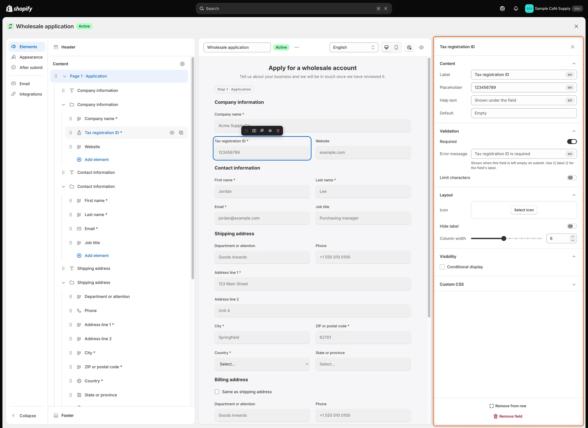
A field’s settings are grouped into sections, from what the buyer reads to when the field shows.
Arrange fields
Section titled “Arrange fields”Move a field
Section titled “Move a field”- In the Elements panel: drag a field by its handle. Drop it on another field to place it above or below, on a page’s name to move it to the end of that page, or on a row’s name to put it into that row.
- In the preview: click a field, then drag it by the handle at the left of its toolbar (Drag to move this field). Drop it on the top or bottom edge of another field to place it above or below. Drop it on the left or right edge to put the two side by side in a row.
Set column widths
Section titled “Set column widths”Widths are counted out of 12 columns, and every new field starts at 12, the full width. Fields that follow each other share a line when their widths fit, so two fields at 6 sit side by side and three at 4 make three columns.
- Drag Layout › Column width in the field’s settings, or
- Click Change width on the selected field’s toolbar in the preview. It steps through a third, a half and the full width.
When the form is narrower than 480 pixels, for example on a phone, every field takes the whole line.
Group fields into rows
Section titled “Group fields into rows”A row keeps fields together and can open them with a head: a label and a description above the fields. You can show, hide or move a whole row at once.
To make a row, do one of these:
- Open the field list and click Row under Layout. An empty row appears in the Elements panel. Click Add element inside it to add fields.
- Open the field list and click Select fields (shown when the page has two or more fields outside rows). Tick the fields in the Elements panel, then click Group into row.
- Add a field to the left or right of another, or drop one beside another in the preview.
Click the row’s name in the Elements panel to open its settings:
| Setting | What it does |
|---|---|
| Label | The row’s title. Buyers see it above the row’s fields. |
| Hide the heading block | Hides the label and description from buyers. They are kept and come back when you turn this off. |
| Description | Text shown under the label. |
| Icon | An icon beside the label. |
| Conditional display | Show or hide the whole row based on earlier answers. See Show, require or disable fields with rules. |
| Ungroup row | Breaks the row up. Its fields stay on the page. |
In the Elements panel, the row’s eye icon hides all its fields and Duplicate row copies it. To take one field out of a row, select the field and click Remove from row.
The Wholesale application form uses rows with their heading block hidden, because each section already opens with a Heading field.
Use several pages
Section titled “Use several pages”-
Add a page
Section titled “Add a page”Click Add page at the bottom of the Elements panel. A page named Untitled page 2 is added and its settings open. Type a new Page name and press
Enter. -
Turn pages into steps
Section titled “Turn pages into steps”Click Content in the Elements panel and turn on Show step progress bar. Choose Step labels: Name and number, Name only or Number only.
Buyers now see one page at a time with a step bar on top. Each page ends with a Continue button that checks the page’s answers before moving on, and the last page ends with the submit button. Without the step bar, all pages show one after another on a single form.
-
Choose whether buyers can go back
Section titled “Choose whether buyers can go back”Every step after the first has a Back button, because Let buyers go back a step starts on. To change it, click Footer in the Elements panel. Turn Let buyers go back a step off to remove the button, or change Back label. These settings show only while the step bar is on and the form has two or more pages.
Click a page’s name in the Elements panel for its settings:
| Setting | What it does |
|---|---|
| Page name | The page’s name in the builder and in the step bar. |
| Hide the heading block | Starts the page at its first field. The heading and description are kept for later. |
| Heading and Description | Shown at the top of the page. |
| Continue button label | The text of the page’s Continue button. Not shown on the last page. |
| Icon | Replaces this step’s number in the step bar. Shown only with the step bar on. |
| Header and footer | Use custom header and Use custom footer give this step its own header text and note. While buyers can go back, the custom footer also has Show Back button on this step. Shown only with the step bar on. |
| Visibility | Show or hide the whole page based on answers on earlier pages. |
| Delete page | Deletes the page and its fields. A form needs at least one page, and the page holding the Email field can’t be deleted until you move that field. |
Header and footer
Section titled “Header and footer”Click Header at the top of the Elements panel, or the heading in the preview:
- Show store logo, then Upload image: a .jpg, .png or .svg file up to 1 MB, about 200×60 pixels.
- Heading and Subheading at the top of the form.
- Show this block to show or hide the whole header.
Click Footer at the bottom of the Elements panel, or the buttons in the preview:
- Submit label, the text of the submit button.
- Reset button and Reset label, a button that clears the form.
- Full-width buttons, or Alignment: Left, Center or Right.
- Note, text shown with the buttons, and Put the note above the buttons.
Hide, copy or remove a field
Section titled “Hide, copy or remove a field”- Hide this block (the eye icon in the Elements panel or on the field’s toolbar) takes the field off the form for buyers but keeps it, with its settings, in the builder. The field leaves the preview and is greyed out in the Elements panel. Click its eye there to bring it back.
- Duplicate field places a copy right after the field and selects it.
- Remove field (on the toolbar or at the bottom of the settings panel) deletes the field when you save.
Preview the form
Section titled “Preview the form”- Desktop preview and Mobile preview switch the width of the preview.
- The inspector button (the target icon) switches between editing and testing. The inspector is on when the builder opens, and the button reads Deactivate inspector: clicking selects things to edit, and rules don’t run, so a field a rule would hide still shows. Click it to turn the inspector off and fill in the preview like a buyer: rules run, and Continue and the submit button check your answers. Nothing is sent. Click it again (Activate inspector) to go back to editing. The shortcut is
⌘ShiftIon Mac orCtrlShiftIon Windows. - Language shows the form in a language you have translated it into. Words not yet translated show in English. To translate, choose Translate this form from … (More actions), which opens Translate.
- Preview (the eye icon) opens the form’s page on your store in a new tab. It works once the form is saved and published.
Save your changes
Section titled “Save your changes”Click Save in the save bar. A Form saved message appears, and if the form is Active, buyers get the new version straight away. Discard throws away everything since the last save.
If something needs fixing, the save is refused and a banner at the top of the preview lists each problem, such as Enter a form name or two fields saved to the same Shopify field. Where a line ends with an arrow button, click it to go straight to the field or setting.
Next steps
Section titled “Next steps”- Show, require or disable fields with rules — ask a question only when an earlier answer calls for it.
- Map answers to Shopify — choose where each answer is saved on approval.
- Design the form — match the form to your store’s look.
- Create and publish a form — publish the form and check it on your store.